Introducing the new Metrics view: container resource monitoring using InfluxDB

Since November 2015, the Scalingo CLI has provided container resource usage in real time. Sometimes you have to dig deeper to truly understand the behaviours of your app. You need to see the evolution of these values to make sense out of them. That’s why we’ve been working on a new metrics view for the Scalingo Dashboard.
Global view
The metrics view is accessible from the Scalingo dashboard just underneath the Containers section. This page contains two main parts: application graphs and containers graphs. You can adjust the viewing period to 3h, 12h, 24h, 48h and 72h in the past. We try to autodetect your timezone from your browser and you can still change it later if needed.
Application graphs
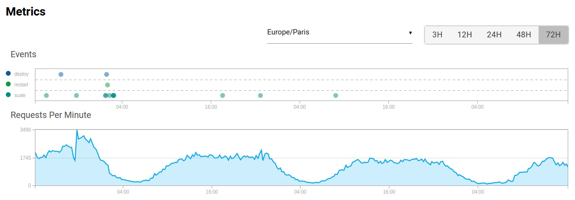
The application graph displays global data that are not container specific: events and routing metrics.
The events graph is here to show you all the events that happened during the viewing period. This can help you link an application behaviour with events that happened on the platform, e.g. spot a deployment that contains a memory leak or follow your application behaviour after a scale up (or down).
A lot of events are available on your application timeline but we think that only a few are relevant on the metrics view:
- Restart event
- Deploy event
- Scale event
We’ll add new event types in the coming weeks (you’ll find the complete list of events in our developer documentation).
The router chart is here to show you how many requests your application gets per minute. It displays you two different kinds of data. The first one is the number of requests per minute, the famous RPM , and the second one is the number of server error responses generated by your application (HTTP responses in the 500 range).
Note: 504 errors can be generated by our proxy if your application takes more than 30 seconds to respond. More information is available in the routing documentation.
Container graphs
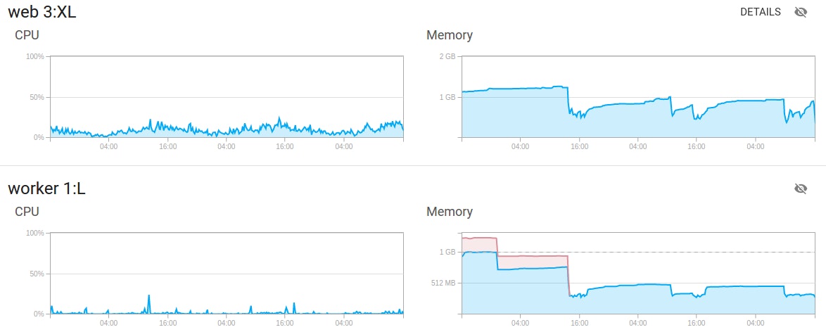
The container graphs use the container types defined in your procfile.
For each of your container type, two charts are shown. The first one shows the CPU usage and the second one the Memory and SWAP usage of this type of container. For the memory chart, we stack your memory usage (in blue) and your SWAP usage (in red). That way you can easily see the total memory usage of your application.
Protip: Is your application slow? Check your swap usage! If your app swaps a lot it will significantly alter your application performance. You’d better reduce your memory usage or use a bigger container size.
Note: The swap line is only shown if the swap usage exceeds 2% of your container memory limit.
If you have more than one container of a specific type, these graphs will show the mean CPU usage / Memory consumption of all your containers of the same type.
Detailed view
If you have more than one container of a type defined in your procfile, you’ll be able to access a detail view of your container. The graphs are exactly the same except that they are now per container (and not per container type). It will help you spot a bugged container and therefore simplify the debugging process.
API Integration
Like every other feature, metrics are fully integrated in our API. The endpoint to access the data is documented here.
Metrics are collected every minute. However to prevent high resource usage of our metrics stack, the API will send you 300 points max per graph. To have the minute precision, your viewing period should not exceed 300 minutes.
How does it work?
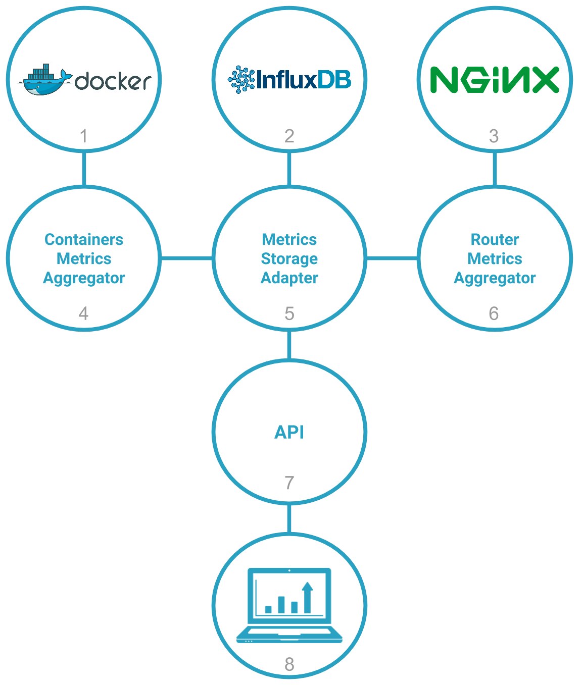
Data comes from two different data sources. The first one is the Scalingo frontend servers (3). Since the beginning, Scalingo uses Nginx to proxy and balance requests to the application containers.
In order to collect and store request informations, we use the NGINX Lua Module which let us intercept many Nginx events and run Lua code. Of course, we kept in mind that this code will be run for each request sent to our platform so the code must run as fast as possible and the codebase must be as little as possible. That’s why the Nginx bindings only send raw data to a Redis server which is used as a buffer. Every minute our router metrics aggregator (6) will collect data in the Redis buffer, aggregate them and send them to our metrics storage adapter (5).
The second data source is the application containers. To get the resource consumption of the containers we use our in house solution called Acadock which was introduced in an older blog post. Once per minute these data are collected on each node by our container metrics aggregator (4) and sent to our metrics storage adapter.
We rely on InfluxDB as a backend to store all metrics data. In order to be independent of this backend we implemented an intermediate service called Metrics Storage Adapter that translates internal API calls to InfluxDB queries. This layer speaks JSON and provides a standard protocol to access and retrieve metrics data.
By the way, we’re very happy with InfluxDB. It perfectly suits our needs and proved to be very reliable. We did a POC (Proof of Concept) nearly 9 months ago between OpenTSDB, Prometheus and InfluxDB. Even if at the time Influx was not the most performant timeseries database, it has proven to improve very quickly.
Finaly, when your browser displays metrics graph, it calls our API (7). The request is proxied to our metrics storage adapter through an authenticated endpoint.
In the future
We already plan to improve a few things to this new Metrics component. For example, we’ll soon add real time updates, response time graphs and an alerting mechanism (the ability to trigger notifications when your containers reach a certain value).
Plus, since we use InfluxDB as an internal product, why not make it available to all our customers as an add-on?
Stay tuned!


