Today is a big day for Scalingo. We are happy and excited to share with you our new logo and new shiny website!
At Scalingo, we value immensely the quality of what we are providing to our users. That includes the User Interface, User Experience, and Developer Experience. And as a matter of fact, constant improvement is part of Scalingo's integrity.
For that reason, we have decided to upgrade our brand image, starting with our logo.
Say hello to our new logo!

A new branding, what does that mean?
Continuous improvement is part of Scalingo's core values.
As a PaaS provider, but also as a brand, we are always doing everything in our power to provide our users with the best experience possible.
We aim towards the development of the European cloud industry, and we want to be the leading sovereign European platform for developers
Our new branding is the result of this continuous improvement and a symbol of our determination to continue providing to our users the high-quality experience that they are expecting from us.
Most of you probably already noticed our new dashboard deployed in August 2021 for all users, this was Scalingo's first step towards our new branding.
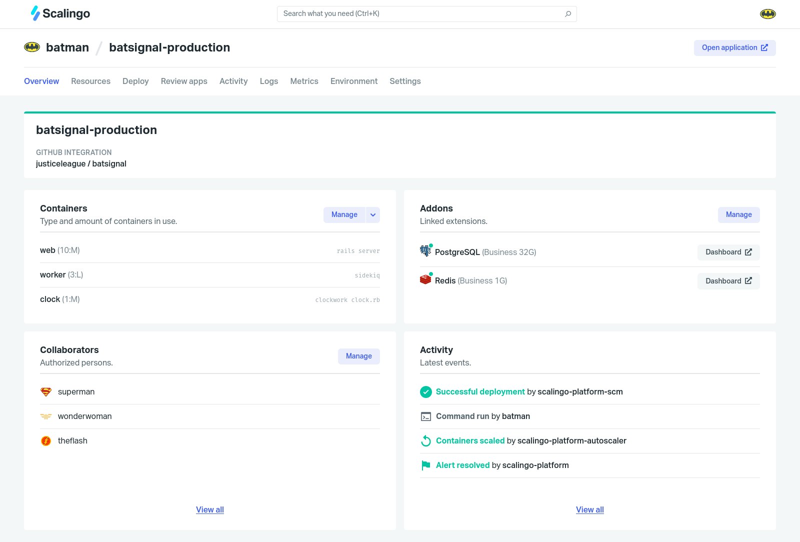
And here is our new website scalingo.com:
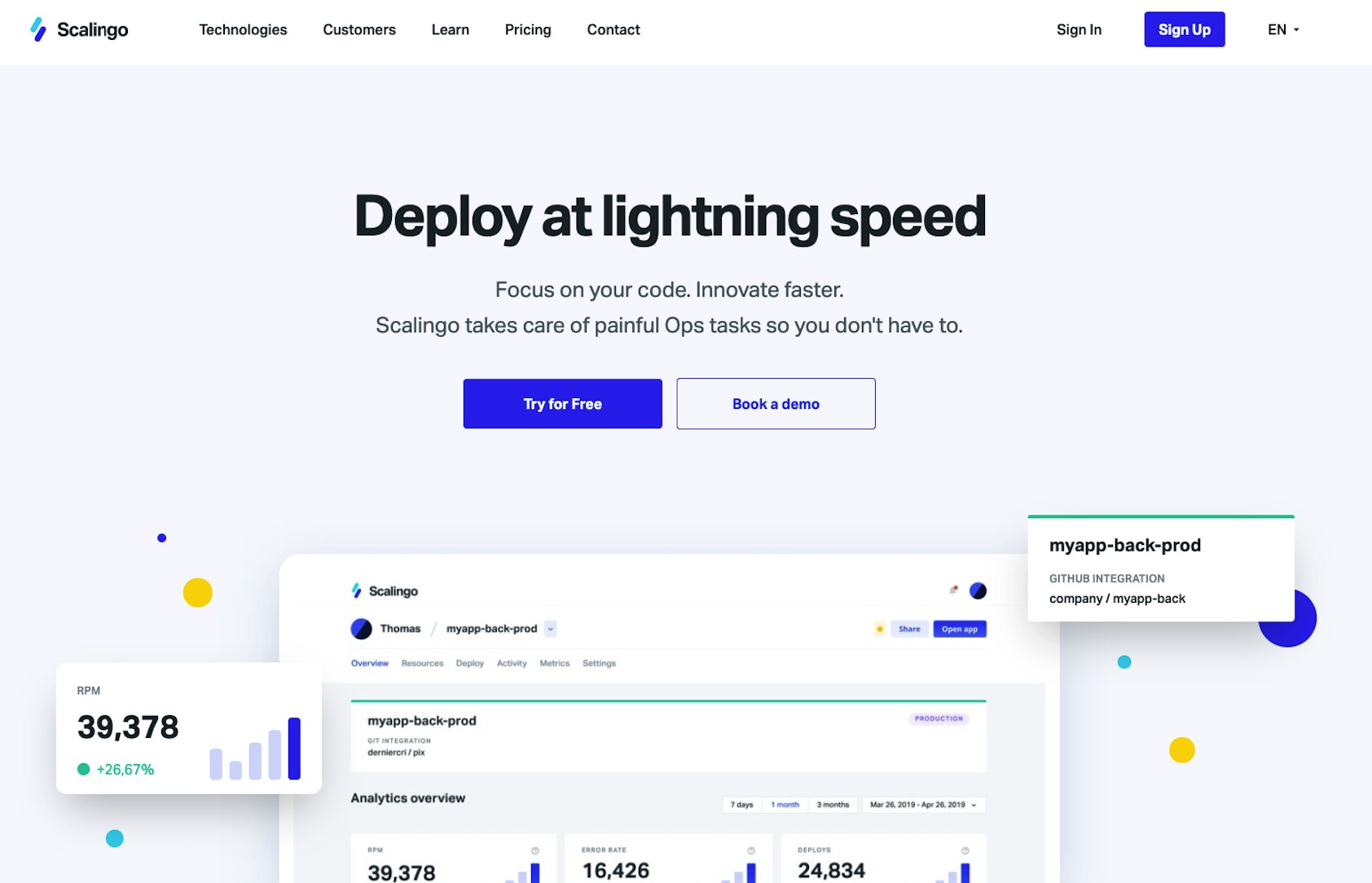
Our new branding and website symbolize the end result of this global redesign. And the start of a new step at Scalingo.
Some background on our new logo
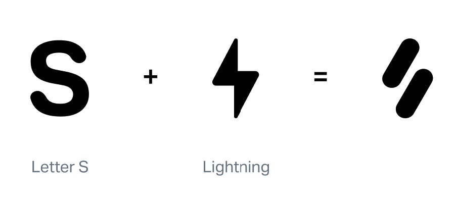
Our previous logo has been around since the creation of Scalingo. We thought that it wasn't representing who we are as a company any longer.
This new logo represents for us the start of a new stage for Scalingo. A stage where we mark our ambition.
For us, this logo update is more than a design change. It symbolizes our values as a company and our transition towards a promising future for the French cloud industry.
To briefly give some background about our new logo :
It is shaped like an "S" with our original colors to represent the first letter of Scalingo, but also keep it minimalist to imply the ease of use of our product.
The shape also reminds us of a thunder icon which implies the strength and the velocity of teams using Scalingo.
On top of that, the "S" represents, Strasbourg, our original city where everything started! And most importantly a city at the center of Europe 😉
Some words on our new shiny design
When it comes to our new website, we've worked in collaboration with Dernier Cri a French web and design agency located in Lille.
We've previously worked with Dernier Cri on our dashboard update. And we wanted to continue with the same expertise to refresh our website.
The result is now available for everyone, we have an up-to-date website, completely redesigned to fit our new brand image!
Discover our new website now
We are more than happy to share this update with you, and we hope that you are as excited as we are about the idea of developing the European Cloud scene!
Our website is now ready for everyone to visit, make sure to give it a look, and feel free to give us feedback on our Twitter if you want to!

Omar Jeridi
Omar is a Junior Marketing Manager at Scalingo. He is passionned about new technologies and by decentralized finance.
Stay Updated
Get articles and platform updates in your inbox.
Ready to Deploy with Confidence?
Experience zero-downtime deployments, intelligent auto-scaling, and fully managed infrastructure. Start deploying your applications on Scalingo today.
No credit card required • Deploy in minutes • Cancel anytime


