12 min read
Introduction to Using Storybook in a Vue.js Project
Looking for a starting point about Storybook in a Vue.js project? Here is our introduction guide to Storybook in a Vue project.

This article is part of a series of tech articles that will explain the challenges that were faced by the Front-end team at Scalingo while revamping our dashboard. This episode is the first one and was written by Cyrille Colon, Software Engineer at Scalingo, the European PaaS.
At Scalingo we have been using Storybook for a year while we were revamping the dashboard used by our customers.
We thought that writing about all our learnings will be useful for other developers and this is why we wrote this guide for Storybook in a Vue.js project.
We will start by a quick reminder about Storybook before explaining different use cases. We will end up the article with tips and tricks about using Storybook in a Vue.js project.
Ready? Let's dive into it!
What is Storybook?
This is taken from the Storybook homepage: Storybook is an open source tool for developing UI components and pages in isolation. It simplifies building, documenting, and testing UIs.
To understand why, let's start with a very simple example.
You want to build a web app, and this app needs buttons. Every app needs buttons, right?
Here is a typical "Update" button:
This typical button is implemented as a Vue component and the code is written in a Button.vue file.
This button component can have many states and be of many kinds.
Now the typical problems every Front-end developers will face are:
without looking at the code, how can you see the button in action with its different states and different kinds?
how can you control that the the minor fix you've just written won't alter the button in all states and kinds?
how can I show my current implementation of a component to my non-developer colleagues?
This is where Storybook will help you.
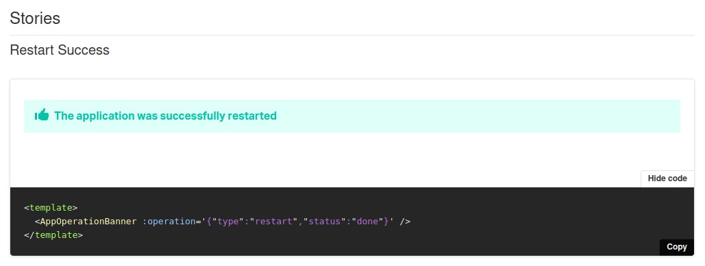
First you will write a story, the list of different instanciations of a component with its different states and kinds you want to see in your Storybook. Usually you want to display an exhaustive list of all states, kinds and properties of your component. At Scalingo we like to call this to storybook a component.
You can then export the Storybook of your project, the list of all stories, and display it in your browser.
This is the code of the button story we wrote:
➡️ And this is what you will get when running Storybook in your browser:
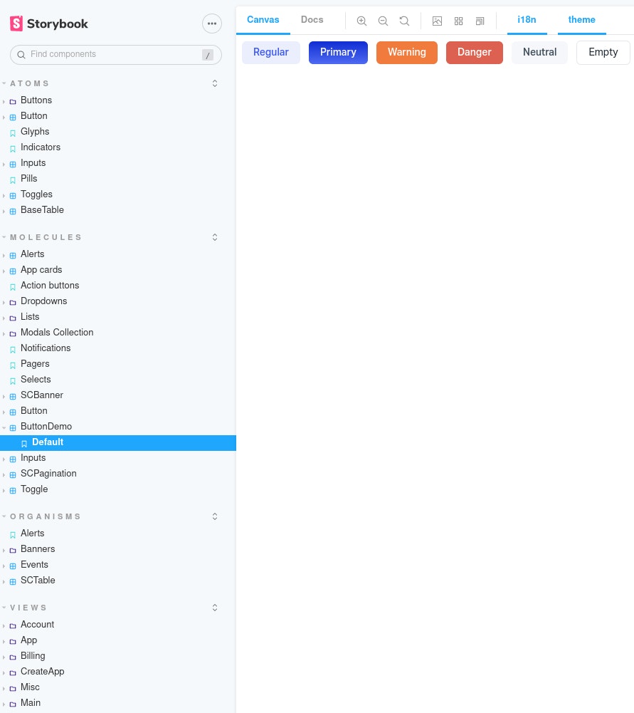
It's not a rendered image of your component, it's a live page! You can really interact with the different buttons.
The component instanciations live in a "canvas" which is running inside a toolbox.
The components inside the canvas behave closely to their real in-app behavior.
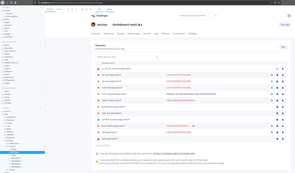
On the left side in the image above you can get a glimpse at the many stories of the dashboard project at Scalingo.
How can you use Storybook for Vue.js?
Storybook as developer documentation
The first obvious Storybook use is for documentation. In Scalingo we use it everyday for our internal documentation.
It does an excellent job here: the search and the tree structure make it easy to find what you want or just to look exhaustively.
Given its auto generated nature, it is always up to date, at no cost for anybody.
Storybook comes with whistle and bells about documentation: the docs tab and the controls panels.
While they are marvelous at first glance, we did not find any practical usage for the controls panels. We ended up using the docs tab only to locate the story component/arguments visible in the canvas.
Storybook as states simulators
An other use for Storybook in Vue.js is using it as states simulators.
Let's imagine you have a table.
The table can have several states by itself (initial, empty, few elements, paginated) and each row may have additional states (for example if the table contains "messages" they can be "sent", "delayed", "draft", ...). Some of these states are mutually exclusive.
Storybook lets you see them all, at the cost of a single click (or less, if you put them together in a single story).
Storybook as a communication tool
An other usage of Storybook can be using it as a communication tool. This will be particularly useful for Product Owners.
A storybook can be exported as a static website with a simple command:
From here, it can be fully used by different persons "out of the box". No API needed. No more yarn & co.
Product owners can easily navigate to an app feature and see all the related states. They can also copy paste links (storybook story URLs) and/or annotate screenshots.
This is very useful when opening an issue and make it very descriptive with the Product Owner intent.
For example, we had to ask an advice to an external designer who was unfamiliar with the project. In a few minutes the person was able to grasp our problem and offer solutions by manipulating all the component states.
Storybook as automated visual tests source
Via some tools it is possible to add automation to a storybook. If you have done visual testing in the past, you may remember it can be quite painful.
Visual testing is often very slow, but the worse problem is "flake".
Flaky tests are tests that sometimes pass, sometimes not, more or less randomly.
At Scalingo we're using Loki.
Storybook and Loki are working really fine together: the amount of flake we had is zero, even with CSS animations in some stories.
Loki/Storybook is also quite fast (200 stories take 60 seconds) and the Loki diff mechanism makes it easy to spot what went wrong.
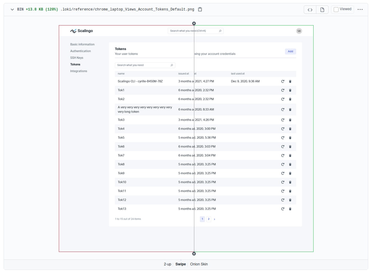
In the example below I made the circle more wide. Loki detected the visual difference and the related story test failed.

And here is the resulting diff image produced by Loki. The differences appear in pink.

Maintenance side, given you can review easily the differences via images and accept a new reference state via a single command line, it is a bliss.
Visual tests really allow us to be confident during release or dependencies upgrade.
Ideally, you want your visual testing automated into your CI.
Storybook creators have created Chromatic for this. Not only it runs the CI tests, but also has some features like serving storybooks or PR collaborations.
We ended up not using it only because of this price. In our case it would have costed more than 2500 euros per developer each year - for only Chrome coverage.
If you want a more complete coverage (3 browsers, 4 responsiveness modes, 2 themes), the price quickly adds up.
Loki has a CI integration, but miles away from Chromatic (no dashboard to explore the build results, manual configuration, ...).
For the moment we just run Loki by hand before release - or at particular times (like deps upgrade). Then, we push the images into a PR request and use Github comparison tools (side by side, swipe, onion skin) to look at the differences.
It is working fine, while not - of course - being perfect.
Storybook as variants viewers
Web apps targets are now larger than ever: very larges screens, mobiles, browsers, dark mode, ...
Storybook canvas can display components under different variants, via parameters.
Out of the box, you will have the ability to change the canvas screen size, but you can code custom parameters.
At Scalingo we added two variants to handle i18n and theming.
Tricks and tips from the use of Storybook for Vue.js from our experience at Scalingo!
Use js format, not mdx
Storybook offers two stories formats: js and mdx (mdx are md files, with the ability to have js sections). We initially picked the mdx format for its improved documentation capabilities. Turn out it was bad idea.
Indeed we did not use the mdx extra features and maintenance with mdx is particularly harder.
It was better to have separate md files for the few points we wanted to document and to use the "more standard" js format. The reason is, especially with Vue.js, you will have less bugs and more documentation online with the js format.
VueDevTools in Storybook
The VueDevTools dot not work in canvas mode but work if the canvas is open in a new tab (top left second icon).
Separate concerns of your components (Controller/Views...)
We made the choice to separate concerns of our components.
Concretely, we have three components types: controllers, views, design system. Controller components are the only one authorized to interact with model (services, store). It allows us to have all other components as "pure" visual components, driven only via "dumb" props.
It leads to easy creation/update of complex view components, via dumb flat json files.
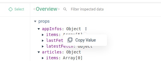
If your component is already functional in a browser, you can use the VueDevTools/component tab to copy the props and paste them in the json file.
Add StoriesWrapper around your stories
There are at least two different reasons to add a wrapper around your stories.
In our case we use nested routing. So the final view component is, in the real app, wrapped around N components. If you have a router, the view is at least wrapped in the App component. Stories wrapper is here to reproduce this "wrapped" environment.
The second reason: the wrapper can also help you control finely the canvas parameters.
Here our preview.js configuration, with our two additional toolbar menus "i18n" and "theme"
And how we use it in our a child called in all our stories wrappers
It is allowing us to mount "app like" view stories, without too much effort. And control them via the Storybook toolbar.
Storybook drawbacks
Of course we want to be fully transparent with our use of Storybook. It can have its painful moments too.
Configuration creation and configuration edition can be a nightmare (due to a high complexity and poor documentation) and each version upgrades can quickly cost you hours. Maybe it is because we use Vue.js, that is not a first citizen framework.
It will be difficult to pinpoint exactly how much storybook costs in "unnecessary" times, but from our experience we would say around 4 hours per month, mainly during broken version upgrades.
This does not count the time spent to update the stories when the app specs changed. Like all tests, the costs will varies with the coverage extensiveness. However, we would say that comparatively to others tests kinds, stories are easily updated.
Conclusion
Every time we want to use a tool at Scalingo we have to ask ourselves two questions:
Can we afford the maintenance cost?
Is the return on investment (ROI) worth it?
In the end, on top of being precious during development phases, Storybook is solving 50% of the visual testing problem for a low price in maintenance costs (dev time spent).
Storybook also facilitates collaboration with non coder teammates or even end users.
We are very happy with Storybook and would recommend it.
If you are a Storybook user, let us know what you think about it by commenting this article!

Yann Klis
Yann Klis co-founded Scalingo. Scalingo's vision is to offer a european sovereign cloud housting platform for developers. Today Scalingo hosts thousands of web applications from customers located all over the world. Before that Yann founded Novelys a web studio specialised in Ruby on Rails technology.
Stay Updated
Get articles and platform updates in your inbox.
Ready to Deploy with Confidence?
Experience zero-downtime deployments, intelligent auto-scaling, and fully managed infrastructure. Start deploying your applications on Scalingo today.
No credit card required • Deploy in minutes • Cancel anytime