Scalingo Dashboard v2
Announcing the brand new Scalingo Dashboard!
The first Dashboard was released back in January with the official launch of Scalingo. Time has passed and over the months we’ve learned about things that doesn’t work so well on the Dashboard, an important piece of software that we need to improve continuously. Today we are proud to present you the second iteration of Scalingo Dashboard, a better tool for you to work with our platform. Alongside this release, the Dashboard received a heavy lifting bringing improvements on features and overall user experience. And always Material Design.
Improved User Interface
Navigation
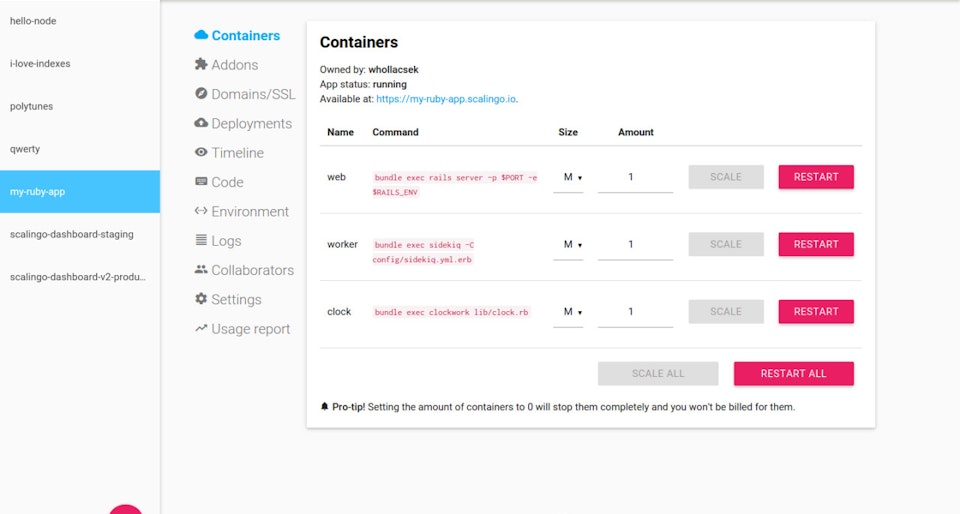
The navigation of the Dashboard has been reworked to present multiple levels of hierarchy as you can see in the screenshot above, with an application navigation drawer, the sub navigation for the current focused application and the main card displaying the current focused set of actions.
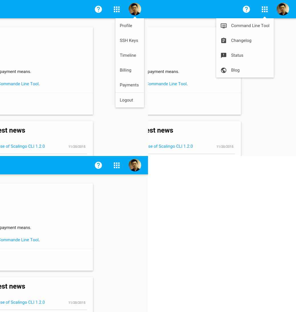
Furthermore, the new header bar will let you have quick access, through a click on your avatar, to your account details and SSH keys among others. Besides of your avatar, you’ll find another quick access button from where you can jump to our Command line tool, Changelog and Status pages. The Documentation Center on the other hand, has a stand along button on the top bar for your convenience.
The application list has been decluttered to show you a cleaner view of your apps when you need it the most. The new side bar received a new contextual behavior and will hide itself while you are doing non-application related work.
We think the new navigation pattern is more intuitive to use, especially when accessing profile details and SSH keys and hope it will improve the time you spend on the Dashboard.
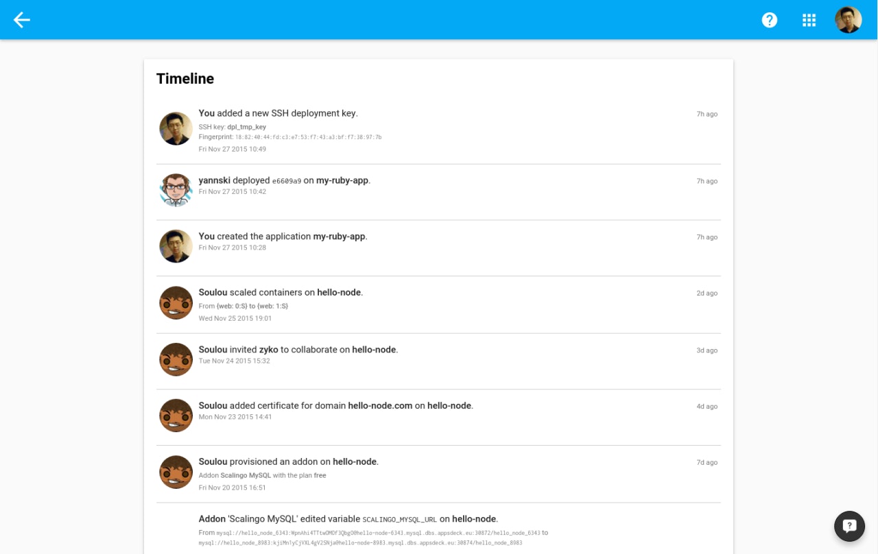
Aggregated Timeline
A new feature introduced in this version is the aggregated Timeline. It will give you an overview of actions you and your collaborators made on your applications. You can access it by clicking on your avatar. A shorter version of the Timeline is also present on the Dashboard homepage to keep you updated.
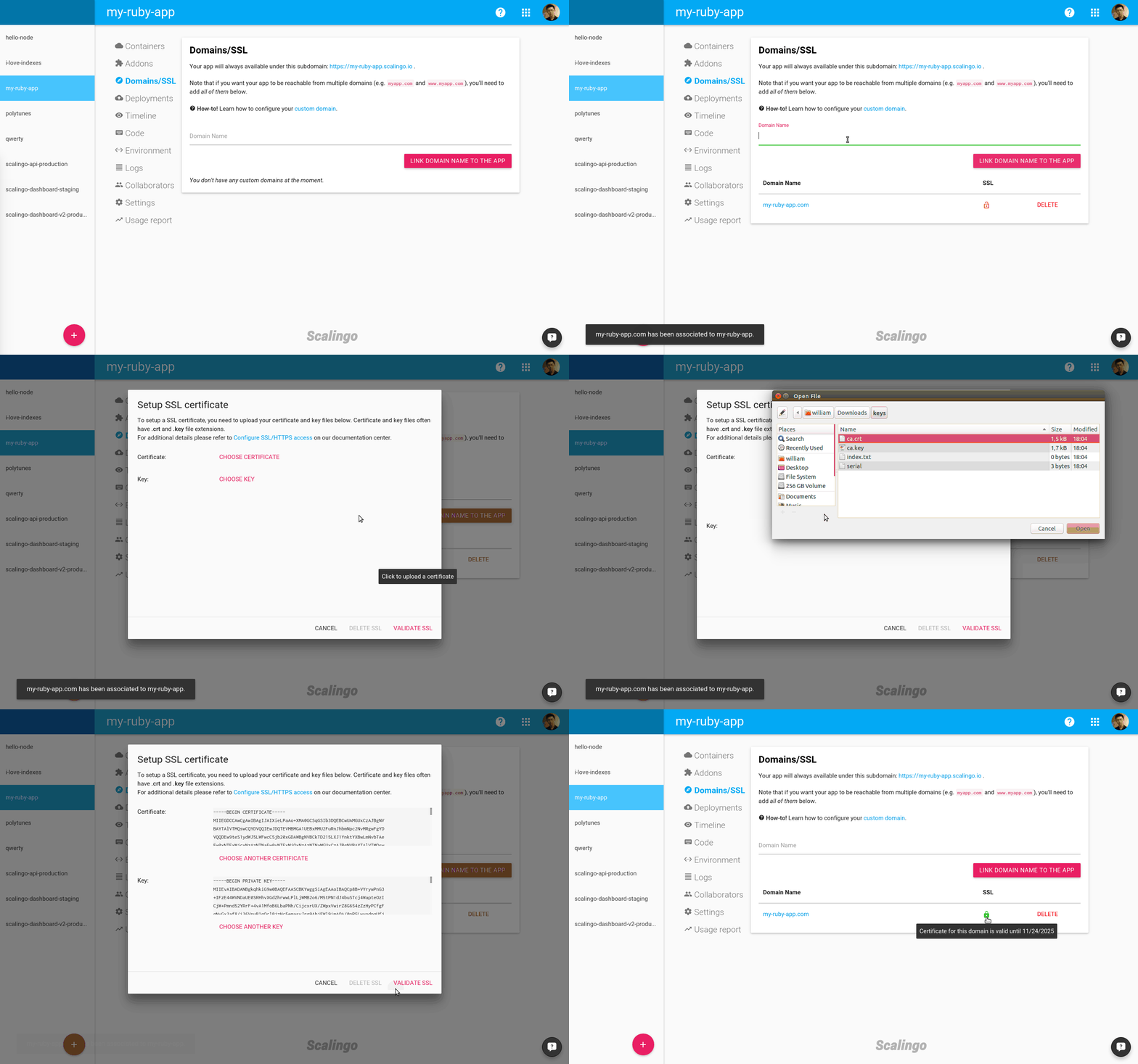
Domain and SSL Setup
We knew the domain and SSL setup page deserve a better UI, so in this release we’ve moved the SSL certificate setup to its own dialog. As always, SSL is free of charge , so there is no reason not keeping your users safe.
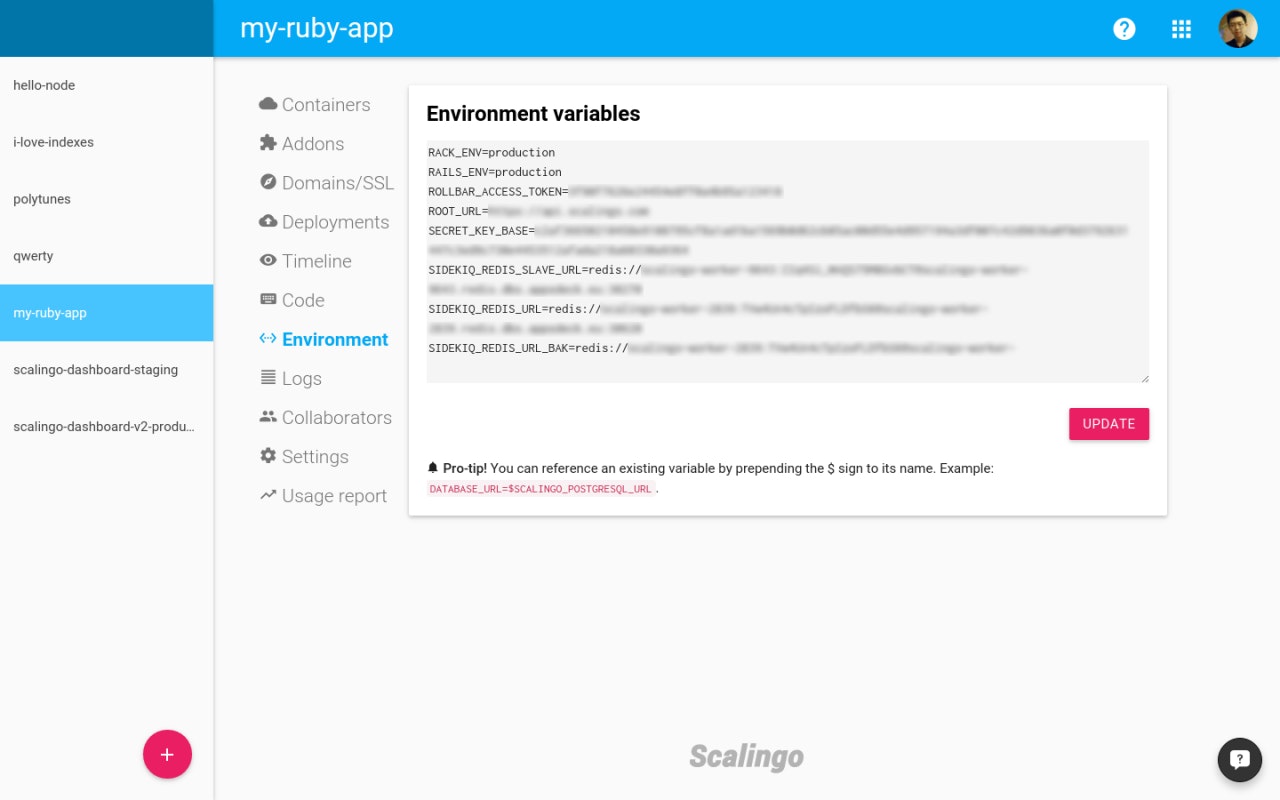
Environment Variables
We’ve noticed a fair amount of users only use the mass edit feature to update their applications’ environment variables which led us to reconsider the best UI for the job. Now, the mass edit is the de facto interface to update your variables. If you think this is a silly mistake please drop us a line at support@scalingo.com.
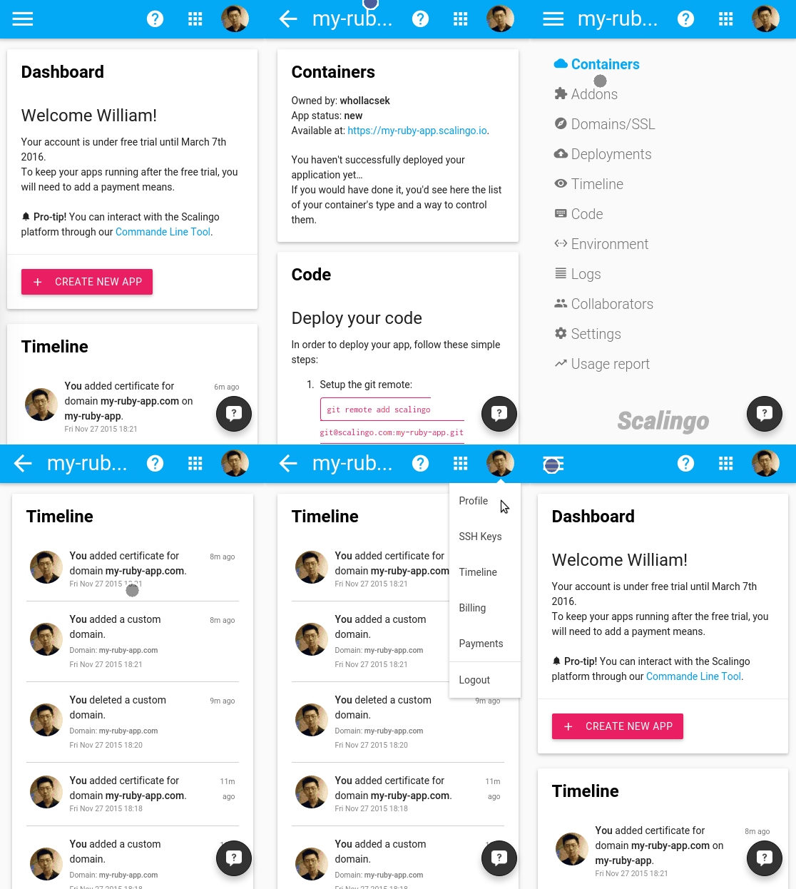
Mobile interface
Even though the Dashboard is not meant to be used on smartphones primarily we made sure to provide you with the best mobile UX possible.
To achieve this we followed the Google Material Design guideline closely and designed a responsive layout that is suitable not only for desktop usage but also for smartphones. With this release, the mobile interface enables you to manage your applications on-the-go, at any time.
Final Words
The Dashboard is built with Ember.js as its previous version but this time we migrated to ember-cli, the new way to build Ember apps. The transition was a big step for us and brought a nice refresh to the Dashboard. We also decided to further our effort to follow Material Design as much as possible with the use of Materialize.
This makeover is part of our commitment to design the best software no matter it’s the core container scheduling architecture or the front-end user interface. Be sure to check out the next Dashboard release, new features are coming!


